Strawberry Singh has revived her Machinima and Movie Poster Challenge for this month. First run in 2013, you can see details and comments about folk’s lists on Strawberry’s blog. The only thing I would add to her post is that there are also a lot of machinima on Vimeo too. Readers of this blog will have read about my dispute with Youtube that I posted here and commented on (artistically) here.
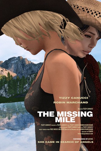
There are now a good number of movie posters from others that can be seen in Glasz DeCuir’s Flickr Group. It’s an interesting challenge, and as I came from graphic design to video, it’s like coming home. I chose one of my own machinima, The Missing Mile, to work with.
The original Brokeback Mountain poster can be found here. One of the interesting things was to actually look at this poster more closely. It has become iconic, recognisable without a second look, which is a good reason to look at it again with fresh eyes! The close juxtaposition of heads is common in movie posters but here it is a little more natural than most.
I produced a simple head drop pose in QAvimator, and photographed Robin and Tizz from slightly different angles. I photographed them against a green screen so I could cut them out and superimpose them against the background. The background, rather oddly, slopes from top right to bottom left. The reflection is somewhat odd too, and I added it in – I think the same was done with the original.
I had to erase part of Robin’s right shoulder and arm so it wouldn’t appear behind Tizz on the left side. It’s possible that Ennis’s larger body thickness would have avoided the need for this in the original. Finally, a film grain filter was put over everything, which was characteristic of the original.
The Brokeback Mountain poster has similarities with other movie posters, as pointed out in this article comparing the Brokeback Mountain and Titanic posters. Movie poster designs, as with book covers, have to be distinctive, but they call on a familiar range of themes that convey an immediate sense of what the film or book is about.
I’ve redone the Vimeo thumbnail for The Missing Mile video using this poster. Extracted frames sometimes work well as covers, but not always, and I think I will be doing some more posters for other videos soon.
Update a couple of days later!
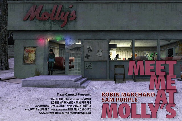
I was never too happy with the snapshot preview for my Meet Me At Molly’s machinima, so I got on with doing a new one:
This time, I didn’t base it on a particular movie. However, the ‘lone figure’ is a familiar theme, if not quite as common as the two heads together.


One thought on “Movie Poster Challenge”